

TL;DR:
- Creating a successful custom t-shirt design requires understanding your audience, using appropriate tools, and planning carefully. Proper preparation, including mockups and physical samples, ensures the final product matches your vision and maintains quality. Testing and feedback are essential steps that transform initial concepts into wearable, professionally finished shirts.
Designing a custom t-shirt sounds straightforward until you’re staring at a blank canvas with no idea where to start. A solid step by step t-shirt design process is what separates a shirt people actually wear from one that ends up stuffed in a drawer. The reality is that 23% of organizers struggle to make their designs look professional, and another 24% simply run out of time before finishing. Whether you’re expressing your personal style or building brand recognition for your small business, this guide walks you through every stage from first concept to print-ready file.
Table of Contents
- Key Takeaways
- Step by step t-shirt design: your setup checklist
- From concept to digital mockup
- Technical prep for printing
- Testing and finalizing before full production
- What I’ve learned designing shirts that actually get worn
- Explore graphic tees that nail the design process
- FAQ
Key Takeaways
| Point | Details |
|---|---|
| Start with your audience | Define who will wear the shirt before sketching a single idea to shape everything from color to typography. |
| Use the right tools and formats | Vector files work best for screen printing; high-res PNG with a transparent background suits DTG and DTF printing. |
| Design at 300 DPI | Creating files below 300 DPI at final print size causes pixelation and ruins an otherwise solid design. |
| Test with physical samples | Order a sample before full production to catch color, placement, and durability issues that screens hide. |
| Simplicity wins on fabric | Limiting yourself to two fonts and clean graphics translates dramatically better from screen to shirt. |
Step by step t-shirt design: your setup checklist
Before you open any design software, you need the right tools in place. Rushing into design without proper setup is the fastest route to wasted hours and files your printer can’t use.
Design software options
The good news is you don’t need an expensive subscription to get started. Free tools like Canva and GIMP handle basic to intermediate designs well, and both support high-resolution exports. If you’re serious about custom t-shirt work long term, Adobe Illustrator is the industry standard for vector-based designs, and Photoshop handles photo-heavy or texture-rich artwork. The choice depends on your budget and the complexity of what you plan to create.
Your pre-design materials checklist:
- A computer with reliable display calibration (colors look different on uncalibrated screens)
- Design software installed and updated
- A reference t-shirt in the target color to judge contrast against your design
- T-shirt blank templates (most print providers supply these as flat mockup files)
- Basic knowledge of your intended printing method before you begin
Understanding printing methods upfront changes how you build your files. Great t-shirt designs integrate both storytelling and printing method choice from the start, ensuring quality and cost-effectiveness. Screen printing favors bold, limited-color designs. Direct-to-garment (DTG) handles photographic detail but costs more per unit. Heat transfer and direct-to-film (DTF) work well for small runs and complex color gradients.
| Printing Method | Best For | File Type Needed |
|---|---|---|
| Screen printing | Bulk orders, bold graphics | Vector (AI, EPS, PDF) |
| DTG | Photo-realistic, complex designs | High-res PNG (300 DPI) |
| DTF | Small runs, full-color designs | High-res PNG (300 DPI) |
| Embroidery | Logos, professional branding | Vector (DST, AI) |
Pro Tip: Before starting any design file, call or email your print provider and ask for their exact file spec sheet. Every shop has slightly different requirements, and finding out after you finish can mean rebuilding your work from scratch.
From concept to digital mockup
This is where the real creative work happens. A repeatable workflow here is what makes the difference between a design you’re proud of and one that looks slightly off without you being able to explain why.
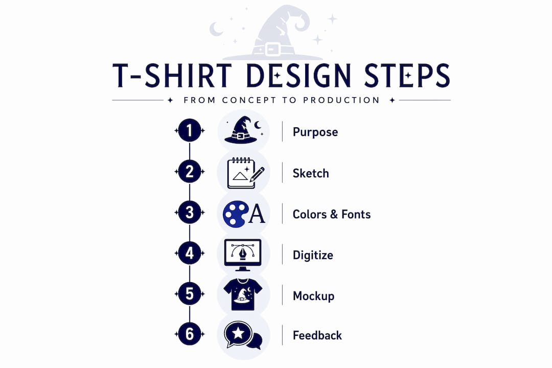
1. Define your purpose and audience
Ask yourself one clear question: who is wearing this shirt and why? A brand tee for a coffee shop carries different visual weight than a personal statement piece for a music fan. Understanding your audience’s daily lives and values is what drives design decisions that resonate. Write down three words that describe how you want people to feel when they see the shirt. Keep those words on a sticky note while you work.
2. Sketch multiple rough ideas
Resist the urge to jump into software immediately. Sketch five to ten rough concepts on paper. They don’t need to be detailed, just enough to capture layout, type placement, and graphic relationships. Sketching is faster than clicking and lets you reject weak ideas in 30 seconds instead of 30 minutes.
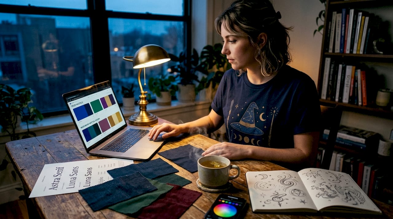
3. Choose your colors, fonts, and layout
Color carries mood. A seasonal harvest design reads completely differently in burnt orange versus teal. For fonts, using max two fonts keeps the design clean and readable on fabric. Pair a display font for headlines with a simple sans-serif for supporting text. For layout, think in zones: primary graphic, supporting text, and white space. Every element should have a reason for being where it is.
4. Build the digital version
Open your chosen software and start with the correct canvas size, which should match your intended print size at 300 DPI. Place your strongest visual element first, usually centered, then build outward. Group related elements so you can move them without disrupting alignment. Save frequently and in layers so you can revise without starting over.
5. Create digital mockups
A mockup puts your design onto a photo-realistic shirt template, showing you how it looks in context. Free mockup generators and Canva templates work for basic needs. More polished mockups using tools like Placeit or Adobe Dimension give you a better sense of how the shirt will appear in the real world. Mockups are also useful if you’re sharing designs with a client or business partner before committing to a print run.
6. Gather feedback from three to five people
This step is one most beginners skip, and it costs them. Structured early feedback from a small group dramatically improves final designs. Show the mockup to people who represent your actual audience, not just friends who will say it looks great. Ask specific questions: Can you read the text easily? What does this graphic make you feel? Would you wear this?
Pro Tip: When gathering feedback, show the mockup on a phone screen rather than a large monitor. Most people will see your shirt promoted on social media through a small screen, and legibility issues that disappear on a desktop show up immediately on mobile.
Technical prep for printing
Getting your design right visually is only half the job. Preparing the file incorrectly sends printers scrambling and often results in a product that looks nothing like your mockup.
File formats that matter
Use PNG with transparent backgrounds for DTG and DTF printing, and vector files for screen printing and embroidery. A JPEG looks fine on screen but carries a white background that will print as a box around your design on a colored shirt. Vector formats like AI or EPS are resolution-independent, meaning they scale to any size without losing sharpness.
Resolution and print size
Designing at minimum 300 DPI at actual print size is non-negotiable. A design built at 72 DPI (standard screen resolution) will look blurry and pixelated when printed. Build your file at the exact dimensions you plan to print it, at 300 DPI, from the very beginning.
Placement considerations:
- Front chest: the most common placement, typically centered
- Left chest: works well for logos and subtle branding
- Full front: bold statement pieces, large graphics
- Back center: great for slogans, event details, or secondary branding
- Sleeve: growing in popularity for brand marks and small graphics
Standard front-chest designs range from 6x6 to 10x8 inches, with 8x8 inches being the most balanced and professional choice for most applications. For vertical positioning, place the top of your design about 3 inches below the collar for a natural, well-proportioned look. Check the print size guide to make sure your dimensions work across shirt sizes.
Pro Tip: Avoid thin lines under 1 point in screen printing files. They tend to fill in during the printing process and can make fine details disappear entirely. When in doubt, thicken every line and simplify small details before sending to your printer.
Testing and finalizing before full production
This is the stage that separates people who end up with great shirts from people who end up with 200 shirts they can’t sell or wear.
Why physical samples matter so much
Ordering physical samples before committing to a full run is one of the highest-return decisions you can make. Screens display colors in light; fabric absorbs them. What looks vibrant on a monitor can appear muted on a dark shirt. A sample lets you see the actual color accuracy, evaluate print sharpness, and confirm placement before spending serious money.
What to evaluate in your sample:
- Color accuracy compared to your digital file
- Readability of all text at normal viewing distance
- Print placement relative to the collar and side seams
- Edge sharpness and detail retention in fine elements
- Durability after one wash cycle (run it through before signing off)
Common issues to watch for
Low-contrast designs are the most frequent problem. A light gray graphic on a white shirt may look distinct on screen but nearly disappear in person. Font readability is the second most common issue, particularly with display fonts at smaller sizes. And graphic scale problems, where a design looks great full-screen but prints too small or too large, are easy to avoid if you check your actual print dimensions before ordering.
Budget planning for iteration
Build sample costs into your project budget from the start. Most print providers charge between $20 and $50 for a single sample shirt. That’s inexpensive protection against a costly mistake. If the sample reveals issues, budget for one revision cycle and a second sample before approving for full production.
Pro Tip: Ask your printer to send a digital proof alongside the physical sample. Comparing both side-by-side reveals color profile differences between your monitor and their printing system, which you can then correct in your source file.
What I’ve learned designing shirts that actually get worn
I’ve seen both sides of the t-shirt design process, and the insight that changed my work the most was this: most design failures aren’t creative failures. They’re planning failures.
When I started, I thought the design was the product. Over time, I realized the shirt is the product. The design only works if it survives the journey from screen to fabric intact. That means understanding your printer’s capabilities before you get attached to a concept, not after. I’ve watched beautifully detailed designs fall apart because the designer chose screen printing for a 12-color gradient that should have gone to DTG. The fix was simple, but nobody caught it until after the samples came back.
The feedback step is where most beginners lose confidence unnecessarily. Hearing “I don’t really get it” from someone in your audience isn’t failure. It’s data. The best revision I ever made to a shirt design came from one sentence of honest feedback that I almost didn’t ask for. That shirt became a consistent seller. The version before it sat in a box.
My honest advice: treat your first three designs as learning projects, not products. Give yourself permission to iterate freely. Check out the best-selling t-shirt guide to understand what actually moves product, then apply that to your creative instincts. The gap between a design you love and a design others love is almost always closed through testing, not talent.
— Josh
Explore graphic tees that nail the design process
If you want a reference point for what a polished graphic t-shirt design looks like in practice, 3wizardclothing has you covered. The store’s seasonal collections show how strong design, the right color palette, and well-chosen themes come together on actual fabric.
The Pumpkin Season T-Shirt is a great example of how layered seasonal graphics balance readability with personality. It’s the kind of shirt that feels intentional from every angle, which is exactly what you’re working toward in your own designs. Browse the full collection at 3wizardclothing and use what you see as inspiration for your own custom t-shirt design process. And for a deeper walkthrough on getting started, the personalized design guide on the 3wizardclothing blog goes even further into the details.
FAQ
What file format should I use for custom t-shirt printing?
Use PNG with a transparent background for DTG and DTF printing, and vector formats like AI or EPS for screen printing and embroidery. The wrong format can result in unwanted backgrounds or blurry prints.
How big should a front chest t-shirt design be?
Front-chest designs typically range from 6x6 to 10x8 inches, with 8x8 inches being the most common for a balanced, professional look across most shirt sizes.
How many fonts should I use in a t-shirt design?
Stick to two fonts maximum. Using more than two creates visual clutter that reads as unprofessional on fabric, where subtle typographic distinctions are harder to perceive than on screen.
Do I really need to order a physical sample before full production?
Yes. Digital mockups do not show color shifts that happen when ink meets fabric. Physical samples reveal placement issues, contrast problems, and durability concerns that screens simply cannot replicate.
What resolution should my t-shirt design file be?
Your design file must be at least 300 DPI at the actual intended print size. Files built at screen resolution (72 DPI) will print blurry and pixelated regardless of how sharp they look on your monitor.
Recommended
- Step-by-Step Guide to Personalized T-Shirt Design Success – 3 Wizard Clothing
- Step-by-step t-shirt care: keep graphics vibrant & lasting – 3 Wizard Clothing
- Role of T-Shirt Graphic Design: Shaping Self-Expression – 3 Wizard Clothing
- Role of T-Shirt Design: Impact on Expression and Retail – 3 Wizard Clothing


